
Flux thinking · Barrowland · Colour & character
A BIT OF NEON. A LOT OF NERVE.
Barrowland doesn’t do discreet. Thank goodness for that.
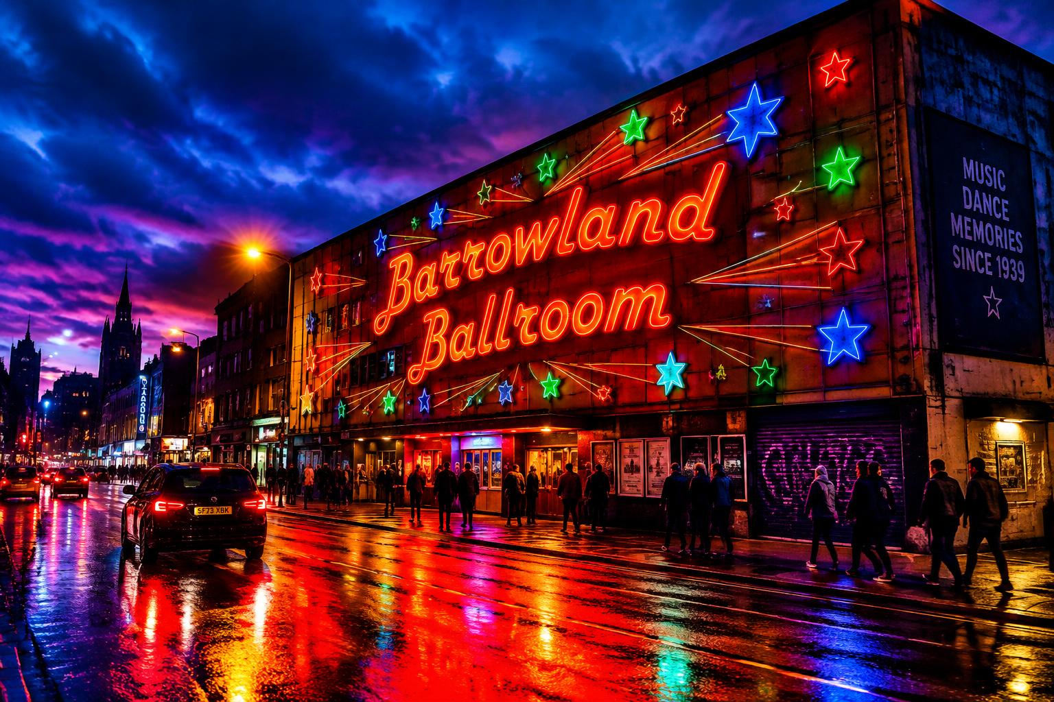
YOU KNOW IT BEFORE YOU READ IT.
The stars. The lettering. That glorious neon. Barrowland has the sort of face you’d recognise halfway down the street, in the rain, with your glasses in the wrong jacket. That’s not a wee decorative bonus. That’s identity doing its job.
It isn’t trying to look like every other venue. It looks like itself. And when a place has that much character, you don’t need to slap “unique experience” across the front. We can see it, cheers.
COLOUR NEEDS A JOB.
In this photograph, the bright lettering and stars cut straight through the dark. The contrast matters as much as the colours. Make everything equally loud and you’ve not created impact. You’ve created an argument.
Same rule on a website. Give your main action a colour people can actually find. Let the background support it. Keep your type readable. Your “Book now” button should not require a search party.
“Your brand needs a personality. Not another shade of corporate apology.”
BORROW THE CONFIDENCE. NOT THE SIGN.
I’m not saying every accountant needs neon stars. Although I’d absolutely attend that meeting. The lesson is to pick something recognisably yours and commit: a type style, a colour combination, a way of speaking.
Then carry it from your website to your packaging, your social posts and your front door. Familiar, not copy-and-paste. Barrowland is memorable because the pieces belong together. Your brand should be too.
WEBSITES
THAT GET
NOTICED.
Distinctive websites, thoughtful branding and SEO that helps people find you.
Prefer a quick chat? +44 7404 238565